
XtendLive


About the product
XtendLive is a B2B SaaS digital events platform, enabling event marketers and event professionals to self-host interactive digital events in a single turnkey product.
My context
I joined as a UX Designer in January 2024 to fix core usability issues and prove the product’s viability. After an MVP launch in May '24, My goal shifted from patching the 3D experience to rapidly designing a new 2D platform that event organizers could adopt with minimal friction.
Joined XtendLive
Jan ‘24
MVP Launch
May ‘24
Pivot to 2D
Aug ‘24
2D MVP
Sep ‘24
XtendLive Timeline (Start – Post-Pivot)
Project Summary
XtendLive initially relied on a 3D “immersive” platform that my user testing confirmed was confusing and outdated. Under tight deadlines, I led the charge to pivot toward a 2D interface that was simpler, more flexible, and ultimately better aligned with real user needs.

Key Challenge
Despite 3D being seen as a unique selling point, user feedback told us it wasn’t valuable. We needed to validate a 2D prototype fast, ensure stakeholder alignment, and then refine the design for a successful launch.

User: "I think I saw something like this in 2009"
Identifying the opportunity
Here, I’ll share the user research that exposed the shortcomings of 3D, how we validated those insights, and the business constraints that made a quick pivot both risky and necessary.
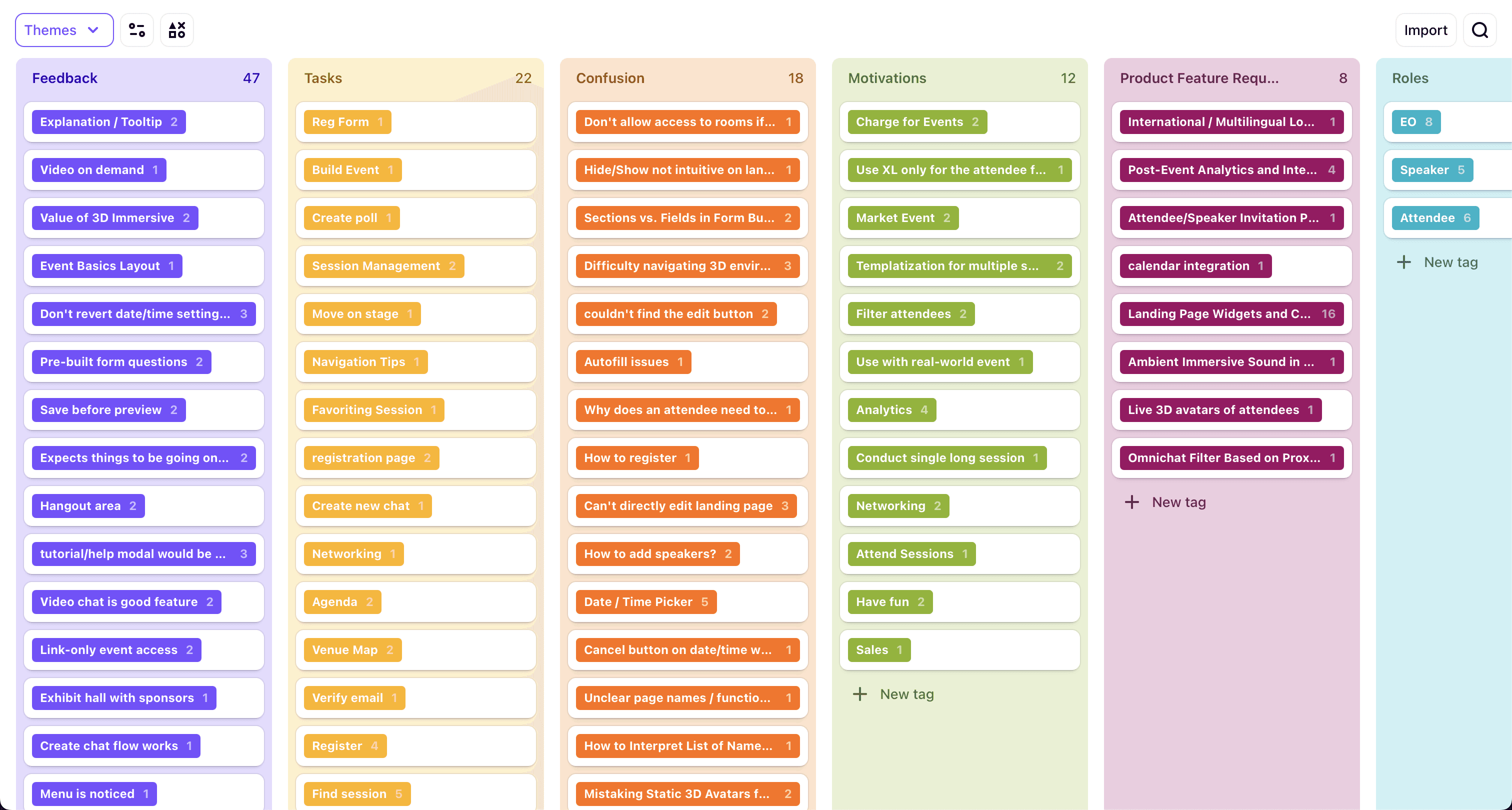
User research & insights
Remote moderated usability tests I conducted with Customer Advisory Board (CAB) members—all seasoned event pros—revealed that nearly all participants abandoned the 3D lobby in favor of simple agenda links. Some explicitly called the 3D look “early 2000s,” undermining confidence in the platform.

User Quotes
3D pain points
3D = Gimmicky & Dated: Users compared it to early 2000s graphics. Some said their audiences would not like it.
Slowed Onboarding: Attendees bypassed 3D, going straight to agendas.
Dev Constraints: Maintaining 3D was resource-heavy, limiting new feature development.

Users quickly abandoned 3D navigation
Business Constraints
Before I joined, the team had missed two launch deadlines, and devs were spread thin maintaining the 3D engine. Leadership needed to see a plan that wouldn’t blow up timelines again.

The 3D environment: resource-intensive and feature-poor
The 2D pivot
With evidence that 3D wasn’t delivering real value, I swiftly repurposed existing components into a more modular 2D interface. Below are the high-level design decisions that shaped this initial version of the new event hub.
Repurposing 3D Components
Instead of trashing everything, I extracted useful modules—like the session agenda and OmniChat—and arranged them in a flexible 2D layout. This let attendees easily open, close, or resize elements without navigating a 3D space.
Old 3D interface with overlaid utilities
Flexible Layout & Updated IA
I designed the event hub so EOs (Event Organizers) and attendees could toggle various panels (e.g., chat, schedule) and keep the interface clean. This also involved streamlining the IA so all key utilities (like agenda, resources) lived in clear, top-level sections.

Ideation sketch for 2D event hub
Resource Library & Content Rail
User feedback highlighted the need for file sharing and sponsor links. I introduced:
Resource Library: A simple upload/download module for PDFs, slides, etc.
Content Rail: A vertical strip for sponsor logos or external links, keeping them visible but not intrusive.

Resource library and content rail mockup
Prototyping & evaluation
Having defined the new 2D layout, I created an interactive prototype to validate our assumptions with internal stakeholders and external test users. This prototype simulated real interactions, from file uploads to chat features.
Building the High-Fidelity Prototype
Using ProtoPie, I created a functional prototype, including:
Fillable fields (e.g., OmniChat messaging & search).
Simulated loading screens to mirror real usage.
Animations & transitions reflecting the flexible panel layout.
Early interactive prototype in ProtoPie
Usability Testing
I tested this prototype with 3 internal sales staff (who also onboard clients) and 6 external testers. They found the 2D interface “clean” and “far simpler” than the 3D version, reinforcing that our pivot aligned with actual user needs.
User: "It's nice… I don't have to go hunting for XYZ… it's all right there"
Presenting Findings to Leadership
Equipped with test results and user quotes, I presented a brief demo to the CMO and other executives. Their initial skepticism about “losing our USP” was eased by seeing measurable improvements in clarity and task completion times.

I actually presented over Zoom, but this dramatization is more interesting
Iteration
With leadership on board, I refined the interface based on testing feedback and final scope decisions, focusing on improving OmniChat, Resource Library setup flows, and the attendee experience.
OmniChat in a 2D Layout
I adjusted OmniChat’s size and placement so it wouldn’t overshadow the agenda. This included optional collapse states so attendees could toggle chat quickly.
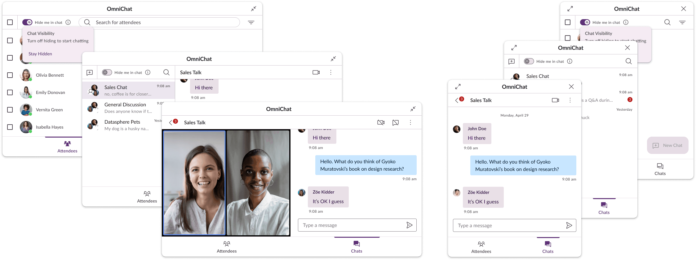
OmniChat
Resource Library & Content Rail
I added a dedicated page for EOs to manage files and external links, ensuring they could preview items before making them live. This helped them keep the event hub uncluttered yet robust.
Resource Library & Content Rail
Attendee Agenda Improvements
To reduce confusion, I added tooltips and hover states for agenda items, so first-time users could quickly grasp session details without diving into separate pages.

Improved agenda
Results & impact
The pivot to a 2D event hub and subsequent refinements had a tangible impact on user adoption and overall satisfaction.
Key Outcomes
Setup Time: Dropped from 20–30 minutes to under 10.
User Satisfaction: CAB members reported the new layout felt “modern and intuitive.”
Stakeholder Confidence: Freed dev resources from 3D maintenance, allowing faster iteration on must-have features (like Multi-User Teams).

User: "Honestly, the UX is your biggest selling point"
Reflections & Next Steps
In this final section, I’ll share the key lessons learned during the pivot and outline how we plan to keep improving XtendLive moving forward.
Lessons Learned
Validate Unique Selling Points Early: 3D wasn’t what users wanted. I knew it would be a problem when I was hired, but I didn't feel confident enough to suggest a pivot of this magnitude at the time.
Repurposing the existing modules: Using existing modules in the new design allowed us to achieve our pivot in an extremely compressed timeline.
Rapid Prototyping + Testing: Showing leadership real interactions and real data was critical for getting buy-in.
Future Plans
Multi-User Teams: Extending the flexible design concept for collaborative event building.
Advanced Analytics & VOD: Addressing top user requests from ongoing feedback.
Continual Iteration: Regularly revisiting user insights to keep the UI streamlined.